Course: Art 223 Introduction to Typography
Term: Spring 2018
Instructor: Amy Decker
Project: Travel Editorial
Rationale:
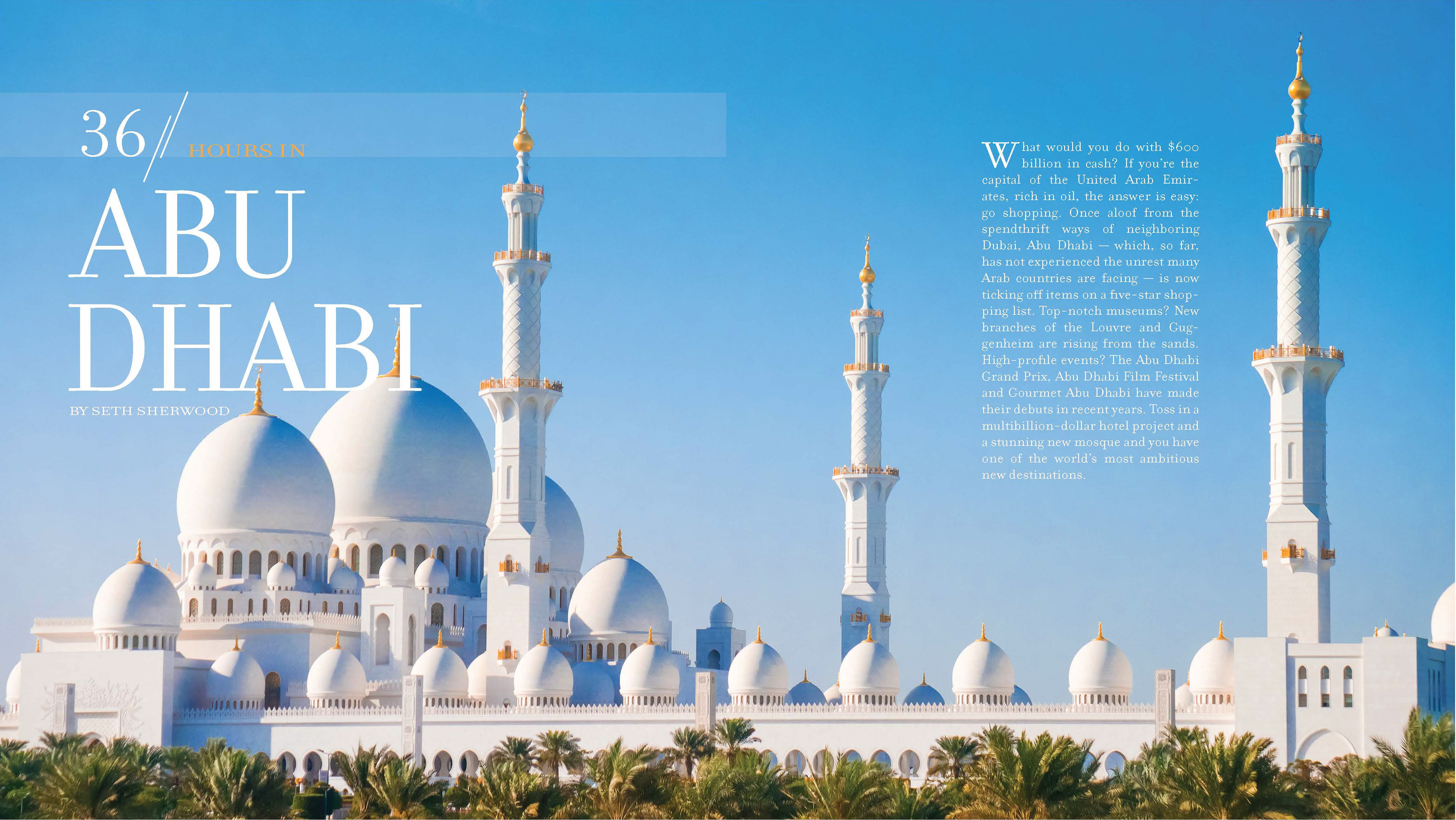
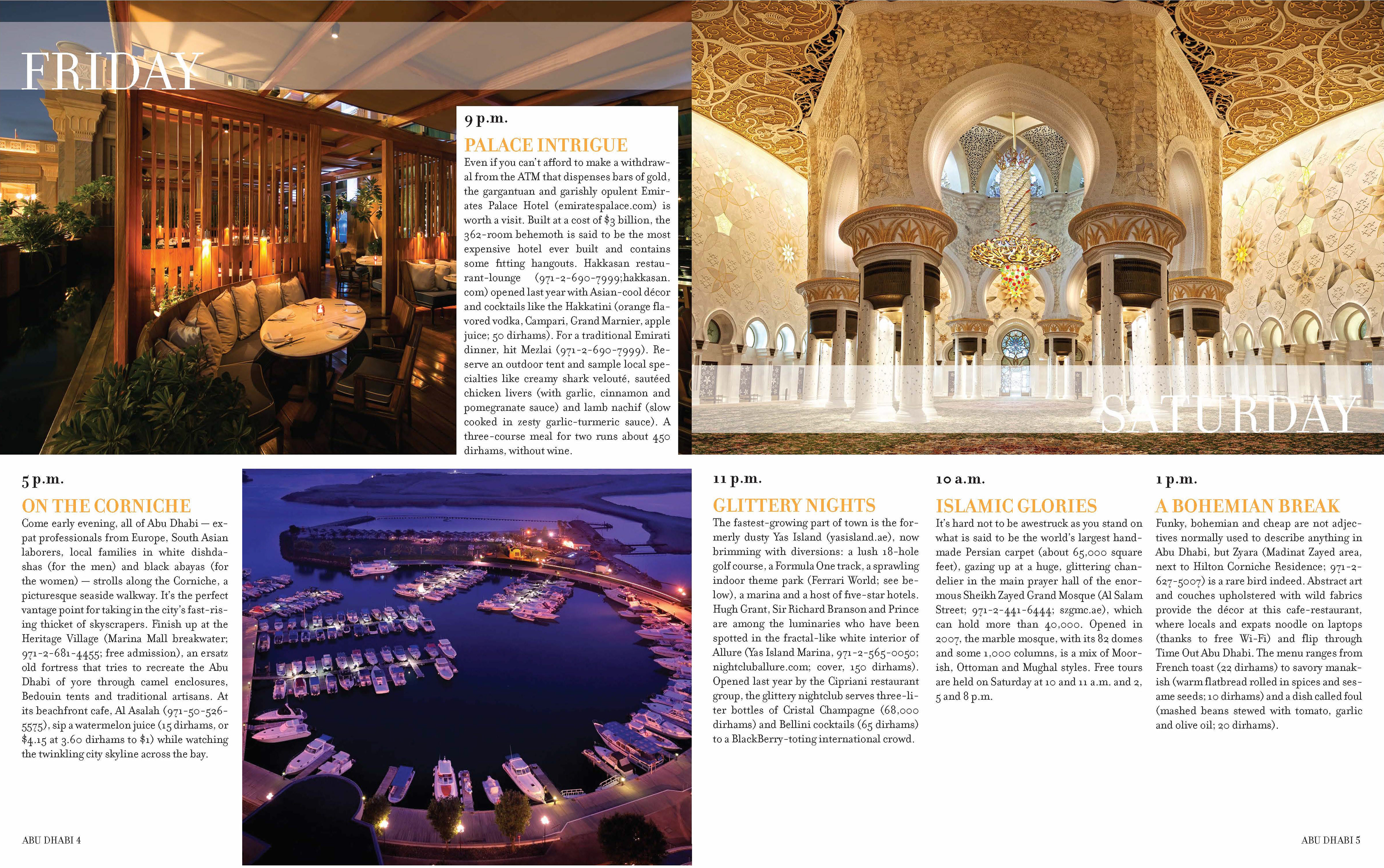
Using a travel story, about a city outside of the United States, from the New York Times
newspaper’s “36 Hour” travel series, design a 6-page editorial layout for the story of your
choosing. The city I have chosen is Abu Dhabi.

Course: Art 223 Introduction to Typography
Term: Spring 2018
Instructor: Amy Decker
Project: Expressive Typography & Metaphor
Rationale:
Madrid is not the only city known for its bulls! Madurai, Tamil Nadu, the city I was born in is known for bulls. In the first version of this design, I manipulated type into a bull head form. I placed some graphic elements such as the ears, horns, and bindi to communicate the meaning visually. In the second version by adding the elements of the bull to the word, they communicate the essence of city visually. I chose the typeface Helvetica Neue Condensed Black because it represents the growing city and boldness of the people. I chose bright colors like yellow, magenta, and blue because that is what they use to decorate the bulls.


Course: Art 223 Introduction to Typography
Term: Spring 2018
Instructor: Amy Decker
Project:Typographic Specimen
Rationale:
I decided to research the typeface Georgia because it was my favorite simple and classic typeface. I used a 10 column grid system to spread my work. I chose a glyph that looked like 3 columns and added texture to add depth. The other triangle and circle glyphs also provided a great addition to the overall theme and composition. I created hierarchy by placing the main title and strapline on the top, and have the copy underneath. The use of a mustard color provides great warmth, contrast, and helps elevate the story. The use of a darker color in “Georgia” and the body copy attracts the viewer's eye.

Course: Art 323 Typography II
Term: Spring 2019
Instructor: Jen Kuhn
Project: Human Rights Poster
Rationale:
Picking one of the articles from the United Nations Universal Declaration of Human Rights, I had to create a poster that would convey the message of the article using visual hierarchy, non objective elements, readability, and legibility.
